Wednesday, January 29, 2014

Some Thoughts on Color...


Artists attending a major art conference were asked by International Artist magazine about their thoughts on color.  I’ve often heard quiltmakers say how they’re seduced by color, how they design with color and that color is the main driving force in their work, so I was very interested to see how these professional painters responded to questions about developing a strong understanding of how to use color.

One artist noted that what held major historical works of art together was drawing, form, value and temperature rather than color and so her recommendation was that it was important to develop a full understanding of value first,  then temperature and only then should one begin work with hue but even at that point try stick to a fairly limited palette.

This is only one person’s opinion of course, and about painting – a different medium – but could this advice be relevant to quiltmakers?  What d’you think?  There are a few quiltmakers well known for their lavish  and undisciplined use of color  and their work is much loved by many quiltmakers.   Are quilts a medium apart?  Where unrestrained color is perfectly acceptable?  I think few of us would be happy with interior design that used many different fully saturated colors!!  And we wouldn’t wear an outfit consisting ofa lime green skirt and a pink top with orange tights and purple shoes and a red hat…or would we??!!

A second artist also stated that he thought that value was more important than color: “all aspiring artists should develop a great understanding of value”.  He felt that color was more intuitive but also more ephemeral and evanescent.

I usually try to work with value: 
 the photo of the neighbourhood pond..

and below, on the right,  a desaturated photo of the quilt I made about the pond...


  The great artist John Singer Sargent wrote:
 “Color is an inborn gift, but appreciation of values is merely training of the eye, which everyone ought to be able to acquire”.
 Anyone can learn to see values.  You don’t have to be born with an amazing talent for it, instead experience and analysis, training and devoted exercise will gain you the skill. Furthermore, a full appreciation of color harmony, often crucial to the piece, can and should also be developed.

A third painter had similar views: in order of importance he felt the artist should carefully consider:
1. placement
2. value
3. edge
4. temperature
Placement refers to the importance of positioning the big shapes so that they relate interestingly and harmoniously.
 Value is the lightness or darkness of each shape or area.
 Edge refers to whether or not the edges of the shapes are crisp and clear, or whether they’re “lost” by being surrounded by similar values.  Paula Nadelstern is an absolute master of lost edges with her kaleidoscope quilts; Ellen Oppenheimer has also used lost edges frequently in her optical illusion quilts.
 Temperature refers to whether the mood of the artwork has been carefully set by  a dominantly warm or cool combination of colors.

   Very interestingly, this artist’s opinion was that frequently when people thought they had a problem with choosing the wrong color for a certain area, it was not actually the color that was the problem, but rather one of  these four things.  I’m sure this is true for I’ve seen people try color after color after color for a certain area – “I just can’t find the right fabric!”  Maybe they would have been better off checking placement or value?  Something to think about next time you’re stuck!!  If you can’t identify the right question, you can’t find the right answer.


This painter went on to say that there was usually no one correct answer when it came to color questions.  As long as the four important steps (above) were correct, then probably any color could be chosen.  I’ve tried to put this thought across in workshops and most people are really receptive to green skies or pink grass, but some people continue hold out for the “traditional” (but not necessarily artistically correct!) colors.
The actual color you choose should depend more on the mood and the feeling you’re trying to convey rather than the local color of the item being depicted.

Another important point that was made was to “paint the color that you see, not the color that you know”. I remember taking a photograph of holly leaves – holly leaves are dark green, right?  In my photo they were black and white!  Holly leaves are very shiny so they reflect the sky when they’re horizontal (white) and they reflect nothing at all when they’re vertical (black).

I really liked this comment from artist Paul Newton:
“If the aim of [art] is to create a unified visual statement, where all of the components are there to support that single statement, then the thing to avoid is a situation where various passages of the [artwork] fight with each other and destroy that unity.  It is much easier to avoid this pitfall when one uses a limited palette.”

Value value!!  Even da Vinci in painting the Mona Lisa, began by painting it in grey values; only when the composition was fully developed, did he add color.

Something to think about! 
And if you have been, thanks for reading!   Elizabeth
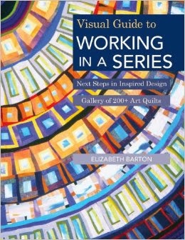
PS I wrote even more about color in my new book Working in a Series, available from me, or from Amazon (they don’t have my signature in the book though!).

Tuesday, January 21, 2014

Imitation: a sincere form of flattery but also a good way of learning.


I’m involved in an experiment at the local university to see if learning the piano (when you’re over 50, I’m not admitting to any more!!)  will improve your brain.  As a former psychologist (don’t worry I do not practice now – in any way!) I’m always interested in HOW, as well as why, people learn things  so I started researching the best way to actually learn to play the piano. 

sunday painting....
Of course, it’s known that frequent short sessions work better.  It’s better to play for 30 minutes a day, for example, than for 3.5 hours on a Sunday – which is a shame for all those Sunday painters and Sunday musicians who hope to make progress with their art! Of course there’s no problem with them Actually Enjoying their Sunday making art or music.  I’m just interested in learning how you can do things better – since I really don’t get much out of playing “Twinkle Twinkle Little Star” for 3.5 hours every Sunday!!  I know I don’t want to stay at the stage I’m at now.

The other thing that really seems to help is massed practice on the areas on which you have difficulty.  So for music, that would mean taking that one awkward bar (or measure)- (hmm interesting that the British associate it with drinking, and the American with amount!! That might say something for cultural differences!!! But I’ll speculate no further on that one!) – and repeating it several times.  My teacher said 5 times but that did nothing for me, however I’ve found that ten times makes a very significant difference.
How could you apply this to quiltmaking?  As I describe in my book Inspired to Design,  there are several distinct steps involved in making an art quilt.  Write down the steps you follow and think carefully: which step gives you the most grief? Can you repeat and repeat and repeat just that step?  I find many people spend much more time on the areas they are good at than on the particular step they find difficult.  Of course we all know (even though the politicians and journalists don’t!) that correlation doesn’t imply causation – but it does make you think!  You’ll stand a much better chance at getting better at something you do a lot of than something you do a little of.  Nobody gets worse with practice!

There was a series of books published about 30 years ago by Timothy Gallwey on how to learn tennis, golf and skiing called The Inner Game of……(whichever sport)…which described various learning techniques, many of them cognitive as well as behavioural.   Barry Green thought it would be interesting to see if the same ideas would work for learning music ( The Inner Game of Music (1986) by Barry Green and Timothy Gallwey).

One of the things he suggested was the imitation of a master player at the game or craft or art form you really want to learn. He writes that if you want to learn a particular style – and I know many of us have favorite artists that we wish we could make work like – then you need to be thoroughly aware of their style.  Can you describe their style in clear cut terms? How does your admired artist’s work differ from that of someone’s work you really don’t like?   What are the actual differences? Can you actually write out a list of them?  Looking at all the examples of their work that you can find – really really looking – will definitely help.  Also discussing their work with  fellow art quiltmakers.

Barry Green then goes on to suggest that you might consider imitation.  Imitating the work will give you even more information – nuances you might not have been able to consciously list.  Apparently many jazz artists have candidly admitted to having memorized note by note famous solos that their heroes have played.  Gershwin said he wrote his early songs to sound as much like Jerome Kern as he could.
Now I’m not suggesting that you would even finish an imitated quilt top, let alone show it publicly – though it might be a very interesting exercise for a critique group  whether you all admired the same artist or not.  But if you really want to learn and improve, frequent daily practice, massed practice on the areas you find difficult and imitation might be something to consider.  There’s so much to learn and it’s so much fun learning!

And, if you have been, thanks for reading!  Reading is good too…..
Elizabeth

Monday, January 13, 2014

Tension is good for you!


I came across a natty little quote from Diana Vreeland, the grand lady of fashion, the other day and it so much pertains to the art of quilts (as well as the art of dressing well) that I wanted to pass it on. 
She said:

“A little bad taste is like a nice splash of paprika.  We all need a splash of bad taste – it’s hearty, it’s healthy, it’s physical.  No taste is what I’m against”.

And havn’t we all seen those quilts that are so bland and tasteless?  Adding a dash of paprika ( or the equivalent thereof)  here and there would help SO much.

 It’s strange but I’m currently working on a sweater that has a sort of Gees Bend-doesn’t-quite-line-up idea to it – 3 front panels of stripes that don’t quite match and the colors I’d chosen were soft and pretty and neutral but oh so safe and oh so dead.  Headed off to the yarn store and what did I come back with but a small hank of paprika wool!!    This was before I read about Vreeland too!!  Weird how sometimes the same idea will come at you from different directions.

They used to say that human beings sought homeostasis – getting everything into perfect balance: everything just right, no tension, no worries, no unexpected, unplanned for events, everything at the right time and in the right place.   But soon they figured out that our minds and hearts and bodies begin to atrophy when everything is just right.

We all know (I think by now!) the Ps of good design – the principal principle (oh what a lovely use of the two spellings of the same sounding word) – of which is: unity with variety or tension or edginess.  People often ask me what tension or edge would mean in the context of a quilt design – I think Vreeland summed it up well: “a splash of bad taste”
Something that doesn’t quite match, isn’t quite in harmony with the rest, is contrasting, perhaps a little out of place but by whose presence the whole is made so much richer, more personal and more authentic.

So please…go and add a little paprika to that dull quilt blocked out on your design wall! 

Apologies for the long lag – due to holiday festivities, a further bout on crutches (well I did need the upper body exercise) and, most recently, a major storm which destroyed all our cable utilities....thankfully now partially restored - just as I was about to go into internet DTs!!
 
And, if you have been, thanks for reading!  Elizabeth