Monday, August 31, 2009

How to achieve instant success….

….well perhaps not instant…and maybe not success either…..but certainly a step in the right direction!

A couple of things that I think really help work to stand out are
a strong colour scheme and
a good range of values. 

I like to plan both out ahead of time….I nearly always envisage a particular colour scheme for a piece quite early on in the planning stage…sometimes it’s the very first thing.  Like desiring chocolate!! I can just taste certain colours at times (and no, I’m not pregnant! nor are any miracles expected.  which is what it would take!)…but sometimes I just feel a need for Many shades of green…

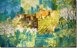
greenmansions

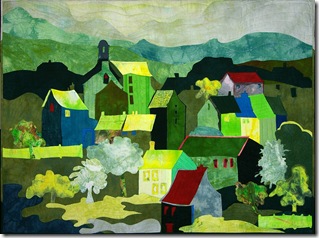
    greenhouses k


on the left – Green Mansions, long ago sold to a mysterious buyer who popped into the gallery while her nails dried (she was having a manicure next door!)…and on the right: Green Houses which is entered into a local art show and I hope will hold up against the oil paintings!

One of the colours I’ve most desired is Red and I’m embarrassed by all the Red somethingorothers that I’ve made over the years!! abstract ones like: Red Shift 1:red shift I

red ones made when I was flaming mad over a re-organization at work that effectively put two well functioning departments together into one totally dysfunctional one: Redshift3,full

but oh how satisfying it was to handstitch pieces of red cloth together! stabbing into the fabric with fervour!!

and then of course there was the Red Gate, Red Chimney, Red Morning and Red Abandon!! I’ll let you check out the website to see those!!

When in calmer and more contemplative mood, I’ve also desired blue:

hamilton bay full

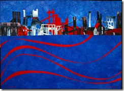
great beautiful swathes of it… here it is on the left in Rusty Answer and
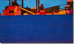
I see I’ve used it again in Brighter at the Top: (below right)
brighteratthetop300

and here it is again in Strange Beauty: (below left)


Adding some red or orange just makes that blue a lot bluer..arn’t those colours just scrumptious?

strange beauty 300 I think if I have a colour scheme in mind, and a dominant colour already chosen (though actually I would say the colour usually chooses me!), it really helps to keep me on track and pull the piece together.


and value….i.e. the light, medium and dark of it (regardless of colour) – a good way to asses the importance of value in making a quilt really zing is to scan it into Photoshop and then increase the contrast (Image, Adjustments, Contrast).

so let’s look at The Memory of Water – the quilt no longer exists as such by the way – I chopped out the best bits!

thememoryofwater230

on the left in its original values…mem

on the right with only the values increased…I should have done this when picking out my fabric at the outset.  Doesn’t it have much more zip?  Actually as well as expanding the value range, I’ve also increased the saturation of a couple of those key colours…and  that too brings a piece to life – as long as you don’t go overboard and drown the whole thing!

Hue, value and intensity – the keys to success!! (as well as all the other things of course…)

and now back to work! if you have been, thanks for reading!  Elizabeth

Tuesday, August 25, 2009

There’s always a way to fettle* it!!

I started a little quilt some time ago and got completely stuck on it because the colours just weren’t looking right, somehow everything looked dingy.  Then I remembered how a dye bath had totally rejuvenated Pump’s Court (below) years ago.  

pumpcourt

I must have tried to make this quilt wearing sunglasses or something because when I got it together the colours were completely hideous!   However after I threw the whole thing into a blue dye bath, not only did it pull the piece together colourwise, creating strange new and interesting colours, but because the blue dye didn’t take where I’d used a gold pigment …it make those sections glow by contrast.


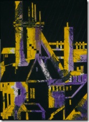
So I thought I’d try for a similar effect with my little industrial piece.  Without the pigment this time…just to see…I figured I could always come back in with some gold if it looked a bit drab.

   flora and ferra k300

This little quilt was a follow up to Flora and Ferra (on the right) working with the same idea only on a smaller scale…..in Flora and Ferra the background was light and the foreground dark.  I thought I’d reverse the values and redraw the image altering some of the proportions.  I liked the composition, it was the dinge that didn’t thrill me….so then I overdyed…this time I used more than one colour.  It’s always good to shift the variables a tad!

bluebeard's castle


I had been going to call it Plant Life…(that was the double entendre name I had left over from Flora and Ferra, but decided I preferred FF!! )but the image came out so castle like…plus I was listening to the Bartok opera Bluebeard’s Castle at the time…..and you know how these industrial buildings have some of the mystery about them of old locked castles!!  I also remembered where my fascination with this kind of building originated…one of my earliest jobs was a technical librarian in a giant chocolate factory (10,000 employees – most of whom would leave on bicycles when the 5pm hooter went – a grand sight as they swooped down Haxby Rd!!).  To get to the technical library aerie you had to make your way up and up miles of winding metal staircases, through echoing halls and oddly shaped chambers……not that I ever had to prove my love for anything but chocolate of course!

And, if you have been, thanks for reading!  I’ll be “off the air” till next Monday as I’m going to Art Camp!  4 days of playing with dye and friends!    And Dai is ever such a lovely chap!  Elizabeth

*Fettle as a verb, means to repair or to smooth;  as an adjective, it means well-knit, all right and tight.  In the West Riding mills it meant to get rid of all the problem sticky out bits on the fabric. A very useful word!

Friday, August 21, 2009

Your own…or the world’s…navel?

Trying to discover why some art textiles really appeal to me on a very deep reactive animal brain level, and others just simper across my brain or flat out leave me cold, I came across an interesting idea from Mel Gooding.  He feels  that the primary purpose of art might be “to enhance our awareness of the true nature of things”.  This was also suggested by Baudelaire many years ago…that  fine art should be “nature reflected” by the artist.

Of course they’re talking about nature in its widest sense – not necessarily landscape, but the true essence of one’s subject. Not just a pretty picture of a house with lighted windows in snow, but how the snow feels, how the light sparkles across the snow, how the house appears so bulky against the effervescence of its soft white wrappings. Or if you make a piece about a cup of tea: how the tea smells, tastes, sounds, feels, refreshes, clarifies, energizes, as well as how it looks.

Are such matters of any concern to art quilters? When I read their statements, it seems to me that too many are gazing only at their own navels. (Or perhaps this is what happens when one is asked to write a statement? )What directions are the serious art quilters taking?

One strong direction is that which reflects the abstract expressionist colour field painters of the 1960s: painters such as Clyfford Still, Mark Rothko and Barnett Newman that I mentioned a couple of blogs back. People like Dorothy Caldwell, Clare Plug, Pamela Fitzsimons, Elizabeth Brimelow, Pauline Burbidge, Eszter Bornemisza and Sue Lawty to mention just a few. These artists are responding to the landscapes they are passionately involved in, trying to reveal the nature and the beauty of the landscapes they see. Interestingly, worryingly,  these artists are all outside the United States.

Within the US, the focus seems much more political. We are currently being riven not by concern for nature, but by large political forces – manipulating us for their own ends. I see this effect upon the bold wonderfully graphic quilters such as Nancy Crow, Terry Jarrard-Dimond, Eleanor McCain and Dominie Nash. I see their work as being more abstract – an exploration of balance: lines and shapes, large blocks of colour – the balance of opposing forces, rather than the exploration of nature. Paintings like those of Judith Rothschild come to mind, or Elsworth Kelly, Otto Freundlich, and Howard Hodgkin.

Another group of art quilters seem to me to be portraying the complexity – to the point of frenzy - of our overpopulated society. There are two fine examples (adjacent!) in the Quilt National ’09 catalogue: Linda Levin and Sandra Woock. In their work you can see the struggle to make sense and some order from the multiplicity of stimuli bombarding us in any urban jungle.

These are just three ”schools” of today’s art quilts. I’m sure I’ve omitted some major folk but my experience is somewhat limited (hopefully not to my own navel!) but to the work I come across in books or on the internet. Like Baudelaire, my thoughts on other people’s work are  “partial, passionate and political” but I hope my point of view opens up some comments (at least) if not the “widest horizons”.
(Charles Baudelaire, from ‘What is the good of criticism?’, The Salon of 1846).

What d’you see? Where is the excellent, thought-grabbing, heart-provoking work?

Put your comments, right here, on this blog!!!

And, if you have been, thanks for reading! Elizabeth

Wednesday, August 19, 2009

The preparatory sketch ….. or not?

Some people start a quilt with just an idea, or a few words, some are inspired by the fabric, some by colour, some have a rough sketch, some have detailed sketch. You bring your own  style and personality to quiltmaking as to other things in your life – if you are a planner, you plan, if you are more reactive to the moment..then you engineer a moment and go from there. And all the stages in between. But you might not always be aware of just how much you do think ahead.  One of my favorite art quiltmakers says she never plans anything ever!! Now I happen to have peaked into this lady’s kitchen cupboards ( I was only looking for tea!) and I saw a very detailed meal plan for the following week….so I’m inclined to take her words about not planning with a grain of salt…or, at least, a cup of tea!!

The Detailed Plan
There are pros and cons to every level of preparation. A very detailed plan for example would be necessary for a precisely pieced quilt…but then one might lose the heart and vigour of the moment? These are the engineering plans of the quilt world. They have a clean predictable beauty, and a strong structure. But the structure could easily become stricture and the piece then runs the risk of being flat, bland and lifeless.

The fairly detailed sketch
Then there is the equivalent of the clearly rendered accurate traditional representational drawing.  This  can be achieved by a fairly detailed (but not compulsive!) sketch – based on real life, a photograph, or an image cast by an overhead projector, or similar device. This method allows for some softening of lines, omission of annoying or unnecessary detail and the sketching alone brings the hand of the person drawing into the piece – bold lines, or more suggestive lines…straight connections or more rounded softened ones. Also you can begin to suggest depth and value with your line quality and shading. The difficulty with this type of sketch is that you are still focused on what the objects actually are, and it’s harder to see just shapes and lines.

The Rough sketch
Working from a much rougher sketch - one which emphasizes the basic shapes – might counter the tendency to see trees rather than forest. We need to see those basic shapes as shapes alone – not houses or trees or parts of buildings etc -  in order to balance them in a way that is harmonious but also with some tension )– i.e. not too well balanced, not too symmetrical and predictable). Working in this way also encourages simplicity – far too many quilts are simply spoiled by too many colours, too many textures and too much junk clarted on top!! This doesn’t mean quilts have to be completely spare and boring. I love Paula Nadelstern’s very rich quilts (currently at the Folk Art Museum and a must see if you’re visiting New York) – but they have a lot of structure: the fabric and shapes are repeated and the larger circle shapes are balanced and organized in interesting ways.

The Spontaneous Gesture
And then…least structured of all, on can begin with a Spontaneous Gesture!  Actually, I doubt strongly that anyone ever works successfully by being completely spontaneous. Yes! That first gesture is likely to be spontaneous:
I feel like red today!! Let me cut a jagged red piece and throw it at the wall!!!”
That’s a beautiful spontaneous expressive start….but then if you want an art work that will work, you have to respond to the Red Beginning…you can’t just say…okay that’s got my red jagged feeling out of my system…now I feel like a nice cup of tea and piece something that looks like a cuppa and place the block next to the Red Beginning and expect it to work! You have to start thinking…okay what shape and colour would balance the Red Beginning…..will it be a blue jagged shape? Or maybe some smaller less jagged red ones…..

So the spontaneous method is great – if you can then harness it and live with decisions and uncertainty every step.

In every method, you need to have an underlying order, structure or pattern of shapes and values. Not too predictable, that’s boring…but not too chaotic, that’s unsettling and unpleasing. We want to take in the whole piece, and then discover the focal area:  the key to the whole…the kernel in the shell.

I’m writing as if you choose one method and stick with it!   …but obviously few do that.
 Jeanne Williamson writesSometimes I have an idea for a piece after looking at a building or photo, and sometimes I don't have any ideas, and simply start with a piece of already monoprinted fabric.

And Carol Taylor responded:   I've done all of what you suggest at times. I never used to sketch at all, but just designed on the board.  Then when I satarted working in series, I would do basic sketches to map out my values and sizes mostly.  Not very detailed.  I use colored pencils allotting a certain color to  indicate which value.  I usually plan with 5-7 values.  Sometimes I write out my idea in words, but not very often. And yes, I usually have an idea ahead of times, but have at times just started because of a certain fabric I’ve wanted to use too. 

and as for me – sometimes i do a rather detailed sketch, but never a very precise one – I find that I would lose the opportunities for adjust a shape or a value or a colour if I did that.  At other times my sketch is very rough…indicating main shapes and values only.  But I always have a clear idea of what i want to make the piece about – though sometimes I struggle to get it into words for the title!

I’m not recommending any one approach over any other but I do think it’s important to know what you like to do – don’t fight yourself on technique!!  Know who you are and your own personal style of working and planning.  Write a paragraph (for personal use only) about what you want to communicate with the piece.

I’d love to hear from you about how you prepare to make a piece!  Thanks for reading!  Elizabeth

Monday, August 17, 2009

Craftsmanship and Color Field

a couple of blogs back there were some questions:

Jackie asked me to clarify what Bruce Hoffman meant by “nonobjective, nonfigurative color field and mark making work”.

I think he was talking about work that is not representational – work that is about something other than the mere objectives portrayed. 

del


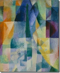
Impressionism, for example, was described by Delaunay as “the birth of Light in painting”.  He felt that Light in Nature creates  movement in colours.  He painted a series of paintings called Simultaneous Windows that explore his ideas about simultaneous contrasts and harmonies in colour.  If you could make a quilt like this!!  you might be perfect for the gallery! 

richardsonlakeabove


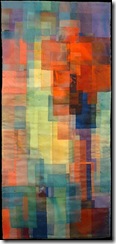
Interestingly, there is a quiltmaker whose work is very like this and that’s Emily Richardson:

As the link shows, Emily’s work is in the “other” fiber gallery in Philadelphia: Gross McCleaf.  A quiltmaker whose work, the Snyderman gallery shows exclusively is Nancy Crow and she also is clearly fascinated by the effects of one colour upon another as can be seen in her Color Blocks series.

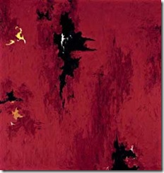
Colour field painting began in the mid 20th century and is characterized by large fields of color, often flat – but not always.

cli  Some of the best known color field painters are Mark Rothko, Clyfford Still (see left)  and Barnett Newman. 

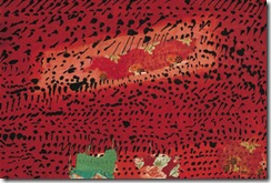
A quiltmaker whose work has some of these characteristics is Dorothy Caldwell: Caldwell extraand she is also represented by the Snyderman gallery.  Dorothy is strongly influenced by landscape and  has just been awarded a grant by the Canadian government to study in the Arctic.


Mark making is a phrase that is currently popular – not so bad as “iconic” (please make sure I have a stiff drink before you use that word!) but definitely “in”.  farneislandsdetail It literally means making marks….but in a very “artistic” sense!!!     I did notice some pieces at the back of the catalogue that Snyderman put out in conjunction with Nancy Crow’s last exhibit that were excellent examples of how one might use “mark making” as an expressive tool.   The most common way quiltmakers are using this technique is via a screen – using a syringe filled with thickened dye one can make marks on the screen…then dry it…then print with clear or dye coloured  alginate.   

ferrybridge k detail


Here are a couple of examples from my own quilts – circular marks drawn on a screen for Farne Islands above, and on the left triangles and scribbles from Ferrybridge.  (Both quilts can be seen in full on my website.)


The other question was about craftsmanship:
Deb asked:  “ I'm wondering about how Hoffman would assess  sewing skills? I like to think my pieces are built to take it but is that what he means?” 

  I think what he meant was merely that the craftsmanship be excellent and not detract from the image.  The point he was making was that quiltmakers have tended to stress craftsmanship – completely understandable initially in the traditional learning phase, over and above composition.  For me personally I hate a regimented 12 - or worse yet 18! – stitches to the inch – I like to see the hand of the maker in the stitches.  If you’re a big flamboyant personality – let those stitches stand out proud!!!  I also don’t mind it if the machine stitching varies slightly in length…we slow down round corners…tiny little steps, and then speed up on the straight – and the steps get bigger! to me that puts the person into the piece.  As long as the stitches aren’t broken and hanging down, or there are lumps where you don’t intend lumps, or worst of all – the quilt appears to be pregnant with a long thin board if the sleeve is on too tight – then I think you’re okay!

and now…back to appliqueing lots of little red triangles onto the Red Cement Works piece which may be called Towering Tanks or may not, as the mood takes me!

so, if you have been, thanks for reading!  All comments welcome…and will (eventually) be commented upon themselves.    Elizabeth

Friday, August 14, 2009

Surface Seduction Revisited

How great to get such a reaction to my blog on beginning quilts “with the fabric”!  Both agreement and disagreement open up a debate and thinking in all directions.  There  was a straightforward question which I’ll answer first and then I’ll comment on some of the many ideas that were raised.

What led you into surface design?   I was intrigued by surface design long before I made quilts – back in the 70s I was screen printing designs onto clothing – I remember some jeans I made with wild flowers growing up from the hem and a skirt with a border of trees and their roots – all very meaningful of course!
I began making quilts after moving to the US and wanting to join in a group to get to know people.  But after a few years I realized I wanted to be in control of the whole process – not just rearranging pieces of fabric designed by someone else.  I don’t dislike commercial fabric prints – when used well by people like Nancy Halpern or Ruth McDowell or Paula Nadelstern (on CBS Sunday Morning this weekend) or Nancy Crow’s early work – but wanted to explore making my own fabric.  They succeed because they use the colour, value and texture of the fabric rather than letting the design of flowers, plaid etc overwhelm them.  Also they all isolate the particular small sections of the fabric that support the meaning of the quilt – whatever it is they want to communicate.  If you’re working with commercial fabric I would look to these amazing artists’ work very specifically, analyzing just how they are using other people’s fabric successfully.

Look at this picture (Thanks to George Rybicki for taking the photograph) of a Nancy Halpern quilt:

NHalp44

See how she has used the value, the temperature and the texture of individual pieces of fabric to create an interesting pattern across the piece which was based on a photograph of leaves floating on water.


I was struck by how many readers wrote about having also had to battle with not allowing the fabric to dominate the piece:
    “having struggled with not allowing method to oust meaning (and often losing the struggle)
   it was so incredibly difficult to get work that went beyond the fabric or the technique .”
  “I often get stuck when using my own dyed pieces because it's hard to move beyond the "seductive" surface to see what greater meanings there are.”

I’ve lost the fight with the siren myself chimney many times
– here’s an early quilt that really was about
the lovely bit of blue and white screen printing in the centre!


Several people wrote about intent – whether it’s of importance or not, whether “to make a beautiful thing”  gives sufficient  meaning to a piece.    The painter Agnes Martin summed up the need for beauty: “All art work is about beauty.  All positive work represents beauty and celebrates it”.    I know I want my quilts to be beautiful and satisfying….but I also think that true beauty is not a shallow meaningless thing:  I was very interested to read in Nancy Crow’s artist statement that she felt that:
The purpose of my quilts is to make something beautiful for me but at the same time they are a means of expression representing my deepest feelings and my life experiences. In addition, my quilts are all about how I see color and color relationships; how I see shapes; and how I see line and linear movements. They are also about complexity, sadness, and hope.
Beauty is rich and meaningful when the piece is personal, when it is a strong arrangement of those basic elements of color, color relationship, shapes, line and movement, and when it conveys a mood that reaches your emotions as well as your visual cortex.  

Even a piece that is more decorative in the sense that it conveys a simple delight in a bunch of flowers , for example, is stronger if it actually communicates the maker’s real honest delight in the flowers:   warming, spirit lifting, energizing!!   I like my flowers to be fresh! not stale.  

Some said that they felt that fabric could be a good starting point for inspiration:  a start, perhaps but not an end.   We can make a piece about a tree or a pair of shoes or a flower – or as  choreographer Mia Michaels did in the show So You Think you Can Dance –  a bottom (UK) or butt(US)!    But the piece to be strong should not be literally about the object but instead about how you feel about the object – what is it that you personally want to tell me that is unique and exciting about that object? It’s the admiration of the object, the playfulness, the elegance or the movement, the power or the glory.  The meaning of the piece can be anything!  Anything that you’ve noticed and want to communicate, or an idea that you just want to work out for yourself.  But I do think you should know what it is…if it’s totally inchoate, then the work will be too – and how then can you judge if you reached your goal?

I definitely agree with the person who compared the descriptions of work in catalogs (“made from cotton, discharged and hand stitched”…etc) to the ingredients in a recipe.   Our art quilts arn’t made from recipes!! (despite cooking workshops!).    And  I do dislike having to suggest that they are - when filling out an entry form.  “Oh yes, this picture is made from paint”!   “This sculpture is made from stone.”   No, it’s made from the mind and heart of the artist utilizing a particular medium

Another question that was raised was whether surface design is an art form?   I would respond is painting and dyeing an art form?  Is mixing dye an art form?  These are techniques that can lead to art….or not.   Complex cloth as defined by Jane Dunnewold is more than a bolt of fabric – yards of stripes or dots.  The colours are contrasted in value, temperature, hue and saturation, the shapes and lines contrasted in their boldness or softness or angularity, the images simple or layered as relating to the meaning that the maker wishes to convey.   Clearly the goals for such a piece of cloth are the same as for any other art piece – that the piece should work as a whole but have areas of contrast, that there be rhythm and movement and a balance of proportion, that there be sufficient elements to convey the feeling, but not cluttered to the point of chaos.  I was so pleased that Jane herself added a comment:
Art cloth isn't just throwing a bunch of processes at the cloth and then sitting back to admire it. The same rigorous standards that apply to any well crafted work of art apply to art cloth...and you can quote me on that if you want to! I think too often people feel they have more license to "play" on an art cloth surface, and the result is a disjointed piece that doesn't fulfill its potential. Part of the message I am always trying to get across in my own teaching.”

I feel that some of my better pieces have actually come about when I’ve considered what I was going to used the fabric for before I made it.   I’ve always loved being on or in water…and wanting to make a quilt about a particular boat trip to a island bird sanctuary, I printed water fabric in as many different ways as I could.  I was thinking about the photographs I’d taken of the many moods of the water we’d experienced on that trip and tried to put them into each piece of cloth.  It’s one of my favorite quilts.

Finally several people alluded to the necessity of Work! 

“But whatever it involves WORK “
  “I have found out lately (and struggle with regularly) is that good design takes time, patience and persistence. Its not something that will be magically found by putting on more layers or embellishments.”

And, having said that – I need to!
So, if you have been, thanks for reading! and do please keep the comments coming….

Elizabeth

Wednesday, August 12, 2009

Quilts from the QBL workshop: working in a series

I just got back from teaching at Quilting by the Lake in Syracuse, NY.   QBL has moved its annual seminar to a really great new facility – a college on a hill overlooking Syracuse and a lake! (Onandonga).   The college has excellent audio visual capabilities, nice new dorms, beautiful auditorium, library, perimeter walking trail – and oh yes! good choices of food! Loads of parking and just a short ride from the airport if you fly. So I’d definitely recommend it if you’re thinking of going to next year’s QBL.  

My workshop was on working in a series , so often recommended because it can lead to a significant improvement in your work:

by getting better at an idea or technique through practice
by being more focused, thinking things through
by exploring an idea in depth
by not putting too many ideas into one piece
by making starting a piece easier by setting a few parameters
by developing a consistent body of work
by trying new things – but with a constant theme – making changes and improvements gradually
    (this is a great way to learn – practice + critique: in the next piece deliberately trying to improve the areas you consider weak in the current work.  This works for everything of course from art quilts, to golf to gardening even cleaning toilets!).

The ladies in my QBL class all developed a theme that they wished to explore in depth, then they drew a number of possible sketches for the first few pieces. The themes were not just general vague ideas e.g.  “landscapes” but – a particular area or place with specific feelings, thoughts, ideas related to that: a full paragraph of information!  A little preparatory work like this can help set parameters and makes decisions so much clearer.    The students also made a commitment to continue with several quilts within their chosen theme.  Everyone began one quilt, several were close to completion by the end of the class, and some people began a second.  A great variety of wonderful unique individual and expressive work was developed – here are some pictures:
jul aug 09 qbl canada 022
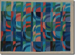
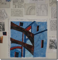
Nina-Marie’s theme was arches – she had collected many images in her Inspiration Notebook (so useful to keep notebooks like this)…from which to sketch and manipulate idea possibilities.  She has captured a wonderful  airiness and sense of space in her first piece.
 

jul aug 09 qbl canada 025

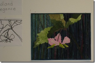
                                                                                                                                                                                 Terry’s theme was not just wild flowers but the elegance and grace of woodland flowers…it really helps to focus in on what it is about your theme that just fascinates you.  Her composition has great movement which shows of the ballerina elegance of the flower.
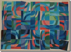
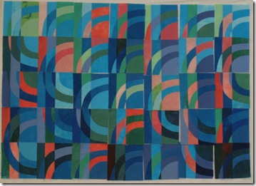
jul aug 09 qbl canada 023 jul aug 09 qbl canada 024Stephanie was excellent at seeing the abstract possibilities in her first sketches of Venice, from which she developed a super little block .  She made about 40 of them… enough to play with.  Her signature block!  Every orientation had a different quality of meaning about it…but she finally settled for the one  jul aug 09 qbl canada 026 that looked like gondolas on the water.  However many of the other possibilities were so strong that I think the series is well on its way!
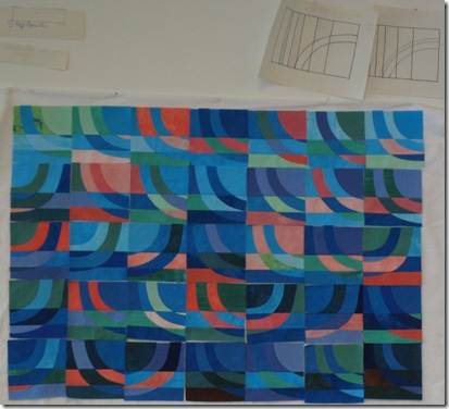
jul aug 09 qbl canada 027

jul aug 09 qbl canada 028

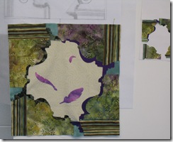
Laura wanted to remember a visit to Viscaya, a mansion in Florida full of fascinating little architectural details…as well as urns of flowers and palm trees and colonnades – this could be a long series!

She brings to our attention with great  sensitivity the little things that might otherwise be missed…also a beautiful sense of the edges of things…look at the  contrast between the shadowed edges of the stone work, and the soft edges of the feathers!

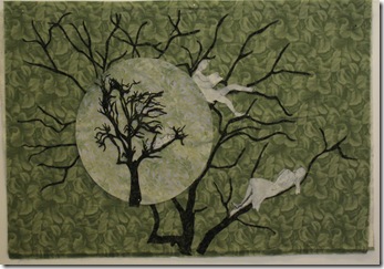
Mary wanted to express the connection between trees and people in a number of different ways…thinking about the spirit of trees, people who might live or appear in trees, and the ways that trees sometimes take on anthropomorphological shapes….In her first piece she has used an interesting device: the whole tree is within a circle superimposed upon a larger detail…..the paper drawn tree people will be finely machine stitch drawn in the finished piece…Mary started her second quilt by making small adjustments to colour, value, shape and line…..    it’s exciting to see the second piece begin to evolve and Mary’s lines are quite beautiful.
jul aug 09 qbl canada 029

jul aug 09 qbl canada 035


jul aug 09 qbl canada 030

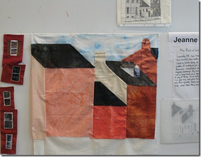
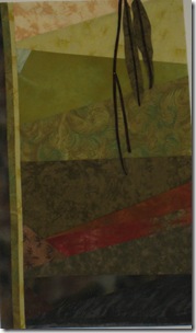
Jeanne planned a series of nine quilts called the Nine Blocks of Lancaster…a great play on the old (but good!) Nine Patch.  she made several sketches, determined values and light sources etc.  She conceived of several ways of making a window but wasn’t sure which would work the best. Following the rule of Make Visual Decisions Visually she made several little windows using different construction methods so she could choose the right one.  Not only is this the best way to decide, but also her little windows will be a great piece by themselves!  Jeanne’s balance of bold shapes will make for a great series!
jul aug 09 qbl canada 032


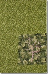
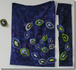
Mary S loves leaves!  She made several beautiful leaf drawings and then decided to superimpose them upon pieced backgrounds to reference traditional quilts…this is the beginning of the willow leaf piece….Mary also was experimenting with value studies….having the values run one way in the background, and the opposite way in the foreground – a great reference to the way that trees look as we explore their shape with the ground behind the lower trunk, and the sky behind the branches.
jul aug 09 qbl canada 034


Priscilla is a garment maker and a mola lover….she took some of the design elements out of the mola and scattered these perky seeds across the background in a joyful dance.   While it was by chance that she placed them on two separate pieces  we all liked the effect so much and the movement it created that we could see this as a garment back with the right sleeve…

Creating movement in a piece is vital to getting and sustaining the viewer’s interest, and Priscilla has achieved this with style!

This was such a fun class to teach – and I had great students!  I look forward to seeing photos of  all the quilts in their series!

I had such an amazing response to my last blog  (August 10th) that I’m definitely going to write a follow up !  Thank you all for writing in, it’s great to stimulate a discussion and I’m energetically cogitating away on the points you all made!

so, if you have been, thanks for reading!   Elizabeth
Monday, August 10, 2009

surface seduction - patting isn't enough

All those surface design techniques (shibori, screen printing (whether constructed, deconstructed, or otherwise disported!), discharge, pastes made of corn, rice, flour, potatoes, old shoes or anything else, stamping (with rubber, foam or gusto), clamping, phototransfer etc etc ) are so seductive!! They're satisfying to make because you've an instant result, often magic! But then, what d'you do with the fabric you've created? I'm sorry, but patting just isn't enough!

Art quilts are begun in many different ways: from a concept, a sketch, an idea, a pattern - but I think the most difficult way to begin a piece is from the fabric itself - which there is a great temptation to do when you have made luscious fabric. Could a painting be about paint? or a sculpture about stone or steel? For a short while there was a fashion to make work about the process - I remember seeing a framed canvas with one knife slash through it....and no paint at all!! But we have seen that. We know that ceci n'est pas une pipe! A painting is paint and canvas, not boats on water, Grandmother's flower garden was hexagonal pieces of fabric (especially if she lived in a city!). Therefore, I think beginning a piece "from the fabric" isn't a particularly valid, unique or interesting idea. Imagine: "hey! I made this quilt about this new fabric I just dyed/purchased!" What do you say in response? There's nothing to say except enquiring how or where...there's no interest in the design.

A quilt about stamping might be interesting to stampers wanting to learn a different way to stamp (raise your legs higher!) but isn't going to be very meaningful to a wider audience. (Thus Hoffman's comment that "quiltmaking is the most redundant when jurying because quilters don't step out of their comfort zone.") If we're only making work about things that interest other quilters, or stampers or tiers and dyers....then those quilts don't add anything to the art world - they are redundant, it's been said.

So despite the seduction of the medium, I do think a concept, or idea or overall structural pattern - something above and beyond the medium itself, that you want to communicate- is important if you wish to make strong appealing pieces. We see this in Joan Schulze's and Linda Colsh's work with images (whether from photo transfer or screen printing) - their images relate to an overall theme, an idea they want to convey - whether the loneliness of old age, or the gilded portrayal of women portrayed in advertising.

The organizing theme could be a concept like old age or it could be an overall patterned structure as in traditional quilts. That's part of the reason why many of those old quilts are so strong. There are many different kinds of organization or structure or "backbone" as Twyla Tharp calls it in her book The Creative Habit work - there's lots to choose from. But I do deplore those quilts that look like sampler pages from a surface design text book.

So now I'd better go and THINK about my gorgeous seductive fabric...as well as stroking it!

If you have been, thanks for reading! Elizabeth

PS - I do enjoy comments, they'll set me cogitating...and my responses will gradually occur in blogs to follow! so please do.....
the next blog, however, should have the pictures from QBL. For tomorrow I fly home - Delta and thunderstorms and shuttle buses willing.

Wednesday, August 5, 2009

The Gallery's point of view

I'm blogging from Burlington, Canada where I'm spending a week relaxing after teaching at Quilting by the Lake - so no camera attachment yet...I'll have pictures from the class (excellent students!) when I get back home next week.

At QBL we had a talk from Bruce Hoffman, director of the Snyderman gallery in Philadelphia, one of the top fibre art galleries in the US. He had some very pertinent comments to make. He always looked for a combination of fine craftsmanship and excellent design and rarely saw the two together in quilts. (This is a challenge!!! Look to your work and decide which area might be weak and focus on making it stronger. I know I plan to do that!)
HOffman went on to say that he felt that quiltmakers need to be held responsible for developing their craftsmanship and design skills. (Of course I know I harp on about this all the time!) Hoffman stated that we need to know how to proportion colour, how to use colour. We need to know the elements with which we work. (I wish he had specified more, but he didn't). However, he did say that he felt that one well known quiltmaker used colour better than most painters. Here is a link to her website! Were you suprised? I think not! If you study her colours, she uses very strong contrasts in value, and saturation and temperature - hue is of less import. Something to learn.
HOffman said that when he curates a show, he feels that his choices become more subjective. His preference for the gallery is for nonobjective, nonfigurative color field and mark making work. It's important to assess your work and see if the type of work you make fits what the gallery you're aiming for actually shows - pointless to even think of sending them images if they don't show your kind of work. He stated that he was always looking for new and fresh work...but has at least an 8 month backlog of portfolios awaiting his attention. I personally know someone who sent portfolios 3 times over 5 years before getting a response. And her work fit his gallery totally! He rejects most of the work that is offered him. It really helps if you have been in several major shows.
He felt that it was important to show that you really know how to use the material with which you work..not clarifying if he meant this literally or metaphorically, however - but I'd guess - both!
Speaking of the Gees Bend quilters, he felt that the new generation don't understand what their grandmothers' work was about. The spirit of their work is gone. When I saw the Whitney show I felt exactly that - there were a couple of more modern pieces, clearly influenced by patchwork patterns and quilting magazines that just didn't have the soul of the earlier work. New cloth, all straightened up and no history, no freshness, no individual voice.
If you want to approach a gallery, he said, a CD with at least 10-15 images that load fairly fast is ideal...plus details, plus a list and resume. Also include a printed out list of the works, and a cover letter, and a printed out resume and price list - making it easy to see your work and find all the information very quickly. (remember 8 months backlog!). Make it clear if the prices quoted are wholesale or retail and also add any special information re the medium or techniques used. Of course enclose an SAE; he also stated that popping in a stamped addressed postcard which stated "The Snyderman Gallery has recieved your portfolio" really helped you to know if the portfolio actually ever got there!
It's the quality not the medium - he stated..and quality is craftmanship+design.

Another challenge: "quiltmaking is the most reduntant when jurying because quilters don't step out of their comfort zone."
So, if you want to make it in the upmarket gallery scene, no more coziness, no more twee images, no trite solutions, excellent sewing skills, and dynamic design! That's all!
If you have been, thanks for reading!
Elizabeth