Making art is a matter of sense and sensibility…
Sergei Eisenstein, the film director, said his process was based on “careful planning” (sense) and “brilliant improvisation” (sensibility).
Sense can be taught – the basics of composition and design, color theory blocking out and sewing together (though these days that seems to be increasingly sticking it together!!).
This be taught reasonably quickly though considerable practice is required for the skills to become fluid.
But sensibility… is a much more gradual process..borne of experience and of opening oneself up to the visual world and one’s reaction to it…
To be able to improvise requires the sensibility to see things in a new and fresh way – an economical stroke that sums up feeling, or pulls out something we’re usually only half aware of. “Art is always an extension of self” ….(Anne Truitt)…
Is sensibility inborn? Can we nurture it by careful tending of awareness of the senses, and the reactions to the sensory input – the making of new memories and the connections to old one? This, of course, will be a gradual and slow process. Robert Genn (quoting Malcom Gladwell) remarked this week that it took thousands of hours of obsessive dedication!
Creative Improvisation is not a random spontaneous act. It is a magical childish hope to think it might be so!! (believe me, I’ve been there!) Successful improvisation is the result of technique being so well practiced that it is almost unconscious…plus the imagination to devise all the possibilities as a conscious mental act and then pick out those that will work with each other in harmony to elucidate the key idea. A musician doesn’t improvise by just blowing or playing random notes that happen to sound wonderful…she or he knows the melody forwards and backwards, the key structure, the harmonic structure, and all the possibilities for variety thereon. They choose their notes with exquisite care and sensibility – similarly a dancer her steps , or a football player his movements on the field!!
This is how Anne Truitt describes her creative process:
“It sometimes happens unexpectedly..a series of sculptures may present themselves somewhere that seems high over my head in my consciousness. They simply materialize, whole and themselves, in a rather stately way, and stand there, categorical in their simplicity..sometimes a single piece will appear..I cannot make them all”
At this point she is examining all the possibilities and has to choose which will be the best piece to make.
“Other pieces result from a more or less conscious concentration on a particular area of emotionally charged personal experience – a person, say, or a series of events, or a period in my life. I have some small degree of control over this kind of formation in that I decide whether or not to accept it…the force of my concentration can also be directed toward single visual events: a glimpse of radiant space, a plant in a lake, a juxtaposition of weights and shapes that matches, touches off , some powerful resonance in me. Certain sensory experiences elicit, draw forth into clarity what visually they only infer. The laws they exemplify seem to spring from behind them, organizing a whole of form and color that lies just beyond what my senses apprehend.”
When asked where she thought art came from she replied that she “thought it possible to put oneself in the way of art much in the same way that cloistered devotees place themselves in the way of religious experience. Art comes, if we are blessed with a little touch of grace, into the highest part of the mind…but we have to pay attention to that area in order to notice the grace, or even perhaps to attract it”.
Is it that “paying of attention” that leads to fabric cut and sewn becoming something more? Is it the sensibility with which we work on the piece that leads to its having greater qualities? If this is so, the more sensibility – the greater sensitivity and awareness, the better the piece.
In our art quilt education, as well as learning the technical bases for quiltmaking, we should also focus on becoming more aware of what we are feeling, thinking and doing as we work on their quilts. May we develop both Sense and Sensibility!
And, if you have been, thanks for reading!
Elizabeth
Saturday, November 29, 2008
Wednesday, November 26, 2008
Taking work to galleries

Since they were usually made from wood, time and “developers” (whom as we know are usually “undevelopers”) have demolished many of them. However, people are beginning to realize their value both as homes, and for businesses. One local
Mary recommended Antiques and Jewels (they don’t have a website, sadly) as a gallery and so I made an appointment with the owner, Karen Fisher, and took some work down to show her. She was very enthusiastic – there was no hesitation about fiber being a lesser medium than paint! My friends in “fancier” places (like DC) say that their local gallery owners are very dismissive of fiber. I find that in smaller, less “sophisticated” (or perhaps I should say less “affected”!) places, people are much more open to possibilities beyond what’s considered “in”. The same is true of fashion of course…
So ..I would encourage you…look to the smaller places, check out the local fashions!, and if there’s a wide variety of acceptable garb….the galleries might be very happy to show your work! And , if you’re in town, visit Antiques and Jewels – they’re on Milledge which still has many old houses. Since I don’t have any pictures of

And, if you have been, thanks for reading!
Monday, November 24, 2008
Mounting Quilts

Dorothy has also done a series of much smaller, quite intimate pieces that are mounted onto dark felt and framed in matt black. These small works also manage to convey a sense of a large landscape – hills, lakes and meadows. The obsessive detailed hand stitching of the background contrasted with the large linear outline stitching is a beautiful and satisfying way of drawing with thread. The contrast forces you to really look at the stitch and picture the artist stitching away dreaming of the landscape! She has an amazing ability to convey a Large Idea into a small space.

A number of artists have become interested in the idea of mounting or framing work – some probably because of
I had made some very small quilts (with traditional binding) for the Showcase but I wanted to see if presenting them more like a painting – i.e. on a stiff base – would be something I could do..and, if I did, would it look good?

And, if you have been, thanks for reading!
Saturday, November 22, 2008
Simplicity: the greatest treasure
It was a review across in this month’s Art in

 One of the master painters of snow simplicity was Georgia O’Keefe – remember this one? (now owned by the San Diego museum of art).
 And this one (sold as a poster)

And her cloud paintings?

And, Alex Katz:

There are several more examples of Katz's amazing ability to paint only the most essential elements at this gallery.
The Scottish landscape (away from man’s fiddling hand with nature!) is awesome, grand and gorgeous in its pure elegant lines.


 And now …back to my quilts! Can I find this simplicity with my needle? Well, perhaps one day…on the long journey..
And, if you have been, thanks for reading!
Friday, November 21, 2008
Small Art Showcase - a new website
 Jeanne Williamson, a good friend, has had a great idea. She has put together a website of small art pieces made by artists who usually work larger. These pieces are moderate in price: all under $500. More artists will be added to the initial twelve as interest grows. The website is purely a set of links with images; if you are interested in anyone's work, just click on their image and you'll be sent to their blog (in my case, a separate "store" blog), or their website. Any sales, therefore, are made through the individual artists.
For me, making work on a different scale is a very interesting challenge. Sometimes I find I have a little tiny idea, that really needs more of an intimate format. Other times I've made a large piece that just doesn't hold together well, but there's a little gem there in one corner, or even in the middle!!! So I was very intrigued by Jeanne's idea and asked if I could be a part of it.
This website is an example of co-operation between people in difficult economic times that I hope we'll see at many levels in the years to come!!
Do take a look!
And, if you have been, thanks for reading!
Elizabeth
Small Art Showcase
Thursday, November 20, 2008
Dear Sugar Plum - be audacious!
By the time I got interested in art, I had enough degrees in other things, did not want to study either core subjects or esoteric things like "Alabaster bowls from the 3rd Century"…but wanted to get straight into the meat! So I was delighted to read that Sir Winston advocated a bold approach when beginning art in later life: “There really is no time for the deliberate approach. Two years of drawing-lessons, three years of copying woodcuts, five years of plaster casts – these are for the young”.
 (detail from a painting of the view in winter from his house)
He felt that while we are unlikely to produce masterpieces, we certainly can enjoy ourselves! He tells a wonderful story about going out and buying a set of oil paints, brushes …seating himself before the canvas (he lived in a glorious house and garden in the south of England, you can visit there today) and then “the empty brush hung poised, heavy with destiny, irresolute in the air. My hand seemed arrested by a silent veto”. How many of us have been there!!!
Finally, he looked at the pale blue sky, carefully mixed a dab of blue and a dab of white paint considering this, at least, was possible ..then “with infinite precaution made a mark about as big as a bean upon the affronted snow white [canvas]”. And sat back…transfixed, unable to go further. He was rescued by a visitor who rushed over, grabbed a large brush and splashed “several large, fierce strokes and slashes of blue on the absolutely cowering canvas. Anyone could see that it could not hit back. No evil fate avenged the jaunty violence. The canvas grinned in helplessness before me. The spell was broken. The sickly inhibitions rolled away!” so don’t worry, Sugar Plum! Be bold! Be audacious!
Churchill liked oil paint because it was easy to correct mistakes and luscious stuff to play with. And that’s true with fabric! We can place..and replace, we can fold and fondle! We can cut boldly and take risks! And gradually improve and enjoy “the glory of the climb!”

A snowy quilt - the view from my home in the Yorkshire dales.
And, if you have been, thanks for reading!
Tuesday, November 18, 2008
Inspirations - from the beginning.
I like looking at things from above – I love getting up onto the roof of buildings and looking down at the view. It’s always good from up there!! Many of my quilts have been based (some closely, some very loosely) on photos I’ve taken from above.
This is Oxford in England. To get this view you have to climb up St Mary's church tower and look away from the dreaming spires!! Those spires are so fairytale - that while they're beautiful to look at, they didn't inspire me as much as the mix of profound and profane that you see looking south across the river to the countryside.

Here's a quilt I made that is very loosely based on the view I saw from the church tower:

The picture below is of St Ives in Cornwall. This is the view from the Tate St Ives (art gallery)... A marvelous collection of roofs and the decent sea...the roofs are covered in a yellow-green lichen that harmonizes them and contrasts with the grey stone of which many are built. Great colour combination!

I've done a number of sketches based on this photograph ..intrigued by the different angles of roofs, and the sides of the buildings, planes punctuated by the syncopation of the chimneys are quite fascinating!! However, so far I've only done one quilt based on it and it has a very calm feeling. I think it was because I was focussed on the distant edge of the houses against the water...and thinking what a calm beautiful place that would be to live..it was also a very warm day when we visited there!!! See how all that comes out in the piece!!!

Below is a view of York, taken from the top story of Marks and Sparks (a well known UK department store - proper name Marks and Spencer). It's not a great photo, though you can clearly see the tremendous height of the minster over the old medieval town - it's the largest cathedral in Europe. So large that I used to take a short cut through it on my way home from school! (I had some pretty weird short cuts!).

I've made a lot of quilts about York over the years - there are so many options: the negative spaces of the old winding streets, the height of the minster behind the buildings, the rooftops...


 John Carlson wrote:
"From the beginning: all creative work is founded upon our earliest impression, when everything was new and fresh and we had no preconceived notions". Carlson thinks these visual memories "ripen and mellow to form a “treasure trove” (a deep well )of inspiration ". He feels we may well be excited by something we see now because it triggers these old early memories.
I think that's why although I see interesting ideas in the modern city where I now live, it's the old medieval memories that come to the front when I face the design wall.
and, if you have been, thanks for reading!
Elizabeth
Sunday, November 16, 2008
The Creative Habit
People sometimes ask me which books I'd recommend and one I've found to be both useful and interesting is The Creative Habit by Twyla Tharp. Twyla Tharp is a dancer and choreographer of great renown. Her book is about the generation of creative endeavours. Her ideas are applicable to any medium and it's also an interesting book as a biography.
Some of the points that she makes:
the importance of cutting out distractions!! switch off the computer!! Stop doing several things at once, try to reduce all that clutter in the brain. I'm often amazed by the pictures I see of people's studios with masses of Stuff everywhere!! (including mine I may add). Seriously, it is hard to think with all that visual and aural stimulation. When I'm really thinking I like it very quiet and very plain. When I'm quilting, I like Bach or Mozart!! they both help me to keep my stitches even!
Keeping a notebook for ideas, inspirations, sketches etc. This should be readily to hand every day. But it need not be a neat and pretty scrap book! any thing will do. I tend to work better on separate sheets of paper, and I pull out bits from magazines everywhere - yes including the doctor's waiting room!! So, for me a large file folder filled with sheet protectors works very well. Then I can pull out several ideas at once and lay them out. My supply list for workshops always begins with an inspiration/sketch notebook. You can use words too!! everything doesn't have to be a beautifully finished sketch. Grab those impressions before they fade! Tharp actually uses boxes for groups of ideas. Years ago when I was a technical librarian in a chocolate factory (yes free chocolate every day!!) we used to keep box files ( do they still exist? I can't find them anywhere) labelled with specific subjects, and then every image or news item related to that subject could be thrown in the file. The box files could be shelved like books and were an easy reference source.
Look for ideas everywhere. They are all around you! Tharp talks about "scratching" for ideas - I imagine her like a beautiful rooster with full plumage scratching around the barnyward!!
Constantly LOOK: travelling, books, museums, galleries, films, nature (especially nature!), old towns, the views from trains.... The thing is: you have to start with An Idea - in a vacuum - is a vacuum. but the idea can be as simple as an abstract shape Emily Richardson (one of my favorite quilters) builds her quilts piece by piece onto a background. While she rarely starts with a specific idea like a photograph of a waterfall or something, she sets up a visual idea with the first piece of fabric she puts up on the background. She chooses a fairly large strong shape and puts it up...this then becomes the idea. Then she begins to react to that shape. This is very difficult of course - but you can see that even this most abstract work began with that one idea. Here's an example (and look at the beautiful elegant simplicity of the values).

Freud wrote that when inspiration did not come to him, he went halfway to meet it!
Other ways that Tharp describes to generate ideas (as well as the crucial LOOK LOOK LOOK), are to do something physical: e.g. drawing, playing with pieces of paper or fabric...sometimes I have got great ideas from the fabrics strewn around the floor of the studio - especially for colour combinations. even though I might not always use them in the piece I'm working on at the moment, I'll "save" that idea, in a notebook or on the wall somewhere. George Harrison randomly picked a couple of words from a romance novel "gently weeps" - then wrote a whole song around them.
well...more tomorrow (or the next day!)...
and, if you have been, thanks for reading!
Elizabeth
Friday, November 14, 2008
Playing with Values
I've spent most of today playing with different value sketches - it's easy to come up with several possibilities quite quickly - especially when watching old movies.
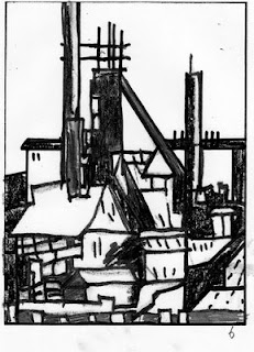
This was my first sketch:
 I quickly decided I needed to crop the top off it .....
then began to shade it in, this was the first attempt:
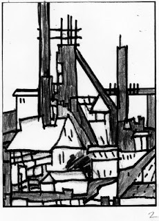
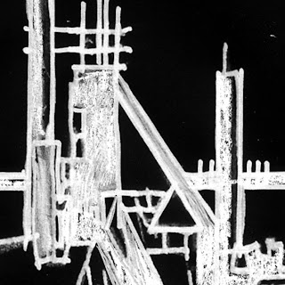
If I can't get the darks very dark, then I'll scan them into Photoshop and adjust the levels, or contrast. Also it's fun to hit Control-I and invert the values; suddenly everything looks very different.
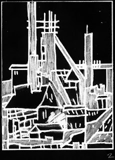 I tried a number of variations and looked at them through squinty eyes....
 of course, you'll probably look better than me!! This is the right way to squint! Note the angle of the head and the slight grimace - very important!
Squinting up your eyes reduces the detail and enables you to see the value pattern more clearly.
I liked this one a lot because not only has it an interesting value pattern, but the value pattern relates to my main idea:
 As you can see that was the 6th possibility I tried. And for each positive value study, I made a negative value study too. which made 12. And there were many more version I could try.
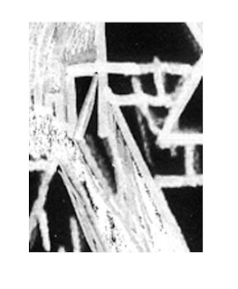
You can also use the mask tool to find interesting crops for possible further abstract pieces!
here were two I found straight away...
Hours of happy fun! "and not a pot washed" as me old dad used to say.....
And, if you have been, thanks for reading!! Elizabeth
This was my first sketch:
 I quickly decided I needed to crop the top off it .....
then began to shade it in, this was the first attempt:

If I can't get the darks very dark, then I'll scan them into Photoshop and adjust the levels, or contrast. Also it's fun to hit Control-I and invert the values; suddenly everything looks very different.
 I tried a number of variations and looked at them through squinty eyes....
 of course, you'll probably look better than me!! This is the right way to squint! Note the angle of the head and the slight grimace - very important!
Squinting up your eyes reduces the detail and enables you to see the value pattern more clearly.
I liked this one a lot because not only has it an interesting value pattern, but the value pattern relates to my main idea:
 As you can see that was the 6th possibility I tried. And for each positive value study, I made a negative value study too. which made 12. And there were many more version I could try.
You can also use the mask tool to find interesting crops for possible further abstract pieces!
here were two I found straight away...


Hours of happy fun! "and not a pot washed" as me old dad used to say.....
And, if you have been, thanks for reading!! Elizabeth
Thursday, November 13, 2008
A quilt finished and a day in the garden
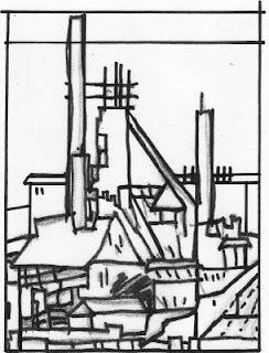
I finally finished the first quilt of a series (I hope!) inspired by seeing the steel mills in Hamilton, Ontario from across the lake. I saw them first from the highway and thought "that looks interesting...hmmm" but you can't stop on a fast highway that's also a bridge! We got off the bridge and under the highway, but even from the roof of the car...couldn't get the right shot. So then my brother joined a yacht club, and studied for "skipper status" so he could take out a boat and FINALLY we got the picture!!
Sometimes it takes a while.
I've got two more "in process". and several ideas in my head. I always like to work in a series because I've found I've too many ideas for one piece. Having made a number of kitchen sink quilts already, I don't need any more.
So this first one is finished:

There's a bigger picture on the website.
The second one is square and a night sky with shibori water...it's about to be quilted - I'm hoping the machine will let me use silver!
The third piece has 3 months worth of handstitched water that has great texture, and just needs marrying to the steel mill!
I'm working on sketches for the 4th piece. I have my basic sketch and am now going to do a number of value studies (i.e. shading in different value patterns to see which is the most interesting) before I even look at fabric. However, since the first one is blue and red, the second purple, grey and rust, and the third blue and orange....I'm leaning towards a soft pink and a dark green...sounds luscious!! of course I love the strange oxymoron of a steel mill and beauty. There is some visually fascinating about the dark satanic mills, you know.
Meanwhile the garden continues to draw me...how can one not love to be part of the stunning glowing autumn colour provided by She Almighty ( Hoeg fans will recognise the reference - and if you don't! you must read The Quiet Girl).

I've been out today planting more pansies, pinks and daffodil bulbs looking forward to seeing them all in the spring. I've done a test pot of daffodil bulbs to see if the raccoons dig them up overnight, though hopefully the bulbs are as poisonous as the rest of the plant!!

When I get the value sketches done, I'll post them - the important thing really is to take your time!
And, if you have been, thanks for reading!! Elizabeth
PS Dave Hickey's opinion piece Revision in this month's Art in America is a must read!! we are more of a pagan society than we know!
Sunday, November 9, 2008
The Artist’s prerogative
“It is the artists’ prerogative to reveal the beauty of common things to those who havn’t noticed”.
And here are two other quotes that I’ve had pinned up on the study wall (to keep me line!):
from Maya Angelou:
“A bird doesn’t sing because it has an answer, it sings because it has a song”.
From Agnes Martin:
“Painting is not about ideas or personal emotion. Paintings are about freedom from the cares of this world, from worldliness. All art work is about beauty.”
I know it’s said that beauty is “out of fashion” in the art world, but I think it is not out of fashion in our lives, in our homes, workplaces and hospitals.
Your aim may be to make art that protests,

that shouts “This is Terrible”:

or is about the process,

or the medium

or beauty!

All are valid aims…I don't think we need to elevate one over (or under) the other, but we do need to strive to make something that lasts and holds true for a lot of people and for a long time.
And, if you have been, thanks for reading!!
PS. Picasso, Nick Ut, Collingwood (who sadly just died), Voulkos (photograph by Noel Allum), Turner.
Saturday, November 8, 2008
More thoughts on "conceptual" versus "decorative" work: a needless division
I received several emails and comments on yesterday’s blog about Maria Buzsek’s article in the Fall Surface Design Journal: “Contemporary Art Criticism”.
One person suggested that women tend to make art that is very acceptable or approachable so they will be included and we need to get over that; another felt that traditional quilts are often more dynamic than contemporary ones, and a third that grannies aren’t necessarily traditional. All are comments worthy of a good discussion over a nice cup of tea!
I don’t know that it’s necessarily a female attribute to desire inclusion – I think probably human beings as a whole are hardwired to seek to be included because unless we’re part of a group we probably won’t survive. So it is natural to want to make work that people like. It is extremely hard to do the opposite. The solution to that I think is to look at the purpose of the Art: it should be about something important and strong and meaningful to you, but it should also communicate. So as you look at the piece, you would say to yourself: what is this about? What is my main idea or concept (yes! A concept!)? and, Am I communicating it?
To the person who noted that traditional quilts are often more dynamic – I totally agree – but it’s not because they are traditional; contemporary quilts are frequently very flat – but it’s not because they are contemporary. Most traditional patterns have had the benefit of being honed over time, and we see the ones that have stood the test of time. In 100 years, many (if not most) of the “contemporary” quilts we see at shows and festivals today will be gone, not strong enough to stand the Time test. I think we can learn a lot from the traditional quilts – why does that one stand out? Why is it bolder, or stronger, or more striking than that contemporary quilt hanging near by? How could I use that information in my own work?
I also agree with the lady who said grannies weren’t necessarily traditional!! I don’t intend to wear lavender and old lace! Or even purple and a red hat! And we definitely must keep striving to learn and improve – in fact I do see far more grandmas willing to do that than grandpas!
And I had some thoughts of my own.
There has frequently been a suggestion that is derived probably from the post Modern movement in the art world that work should be about or at least strongly relate to the medium in which it’s made. (“an essential regard for their unique material properties”, Buzsek). Therefore, Tracy Emin is justified in making her statement blankets (here’s a couple more, by the way)


because much of her work is about the bed, about losses and gains that were made in that situation, about what blankets mean to her.
Ghada Amer’s embroideries contrast the delicacy of the embroidery (a medium usually associated with women (though I had two uncles that embroidered!)) with the subject of the stitches: war, slavery etc. She doesn’t just use the embroidery as a medium, she uses it as a contrast and a protest.
However, I can’t see that it’s necessary to make the medium part of the message: the artisans who made the glorious tapestries for the castles, the cave painters who ground up rock and mixed it with saliva, the carvers of totem poles, the weavers, painters in oil and water based mediums etc have always made work about what was important to them without necessarily considering which medium to choose. The medium was the voice. The type of voice should definitely be considered (soft, harsh, loud, mellow….) but whether to use A Voice as opposed to A Cello or A Drum is, I think, arguable. For those of us who stitch, our voice is The Stitch.
It's important that
1. our work has meaning, and
2. that we communicate that meaning and
3. that our workmanship is excellent. The Tracy Emin blankets above are beautifully worked - layers of felt and cloth stitched well onto the blankets; Amer's embroidery is exquisite.
Perhaps more tomorrow!! Please post or send me your comments- especially if they give a different perspective!
This is getting a little long, so it’s time to go for a walk and think some more!! Here are a couple of views from my daily walk!


And, if you have been, thanks for reading!
Friday, November 7, 2008
Quilting Granny meets Tracy Emin!

There was a very interesting article on criticism in the textile arts in the Fall 2008 Surface Design Journal. The author, Maria Buzsek (art historian and critic at Kansas City Art Institute) feels there is a deep divide between what she calls “quilting grannies” and emerging conceptual artists. She felt that her students’ work was “freewheeling, diverse and conceptual” as opposed to the “formalist or utilitarian” work seen in many fiber shows.
She wonders why there are not more fiber shows that feature more adventurous and conceptual artists such as Tracy Emin, Allyson Mitchell, Jenny Hart, Mark Newport, Erica Spitzer Rasmussen, Orly Cogan, Yinka Shonibare, Ghada Amer and Two Girls Working.
She felt that there are two very different types of work evident in today’s textile art world:
the “craft world” which insists upon the romance of the medium
versus the "art world" focused on the romance of the conceptual. And as a result many contemporary artists in this medium find themselves caught in between these two extremes.
Buzsek feels that part of the blame lies with the museums – who have historically tended to divide themselves between the decorative and the conceptual, and journals/magazines who have done likewise. (However, there are now beginning to be some shows – here in the US – particularly the two shows at the American Craft Museum aka Museum of Art and Design: Pricked: Extreme Embroidery and Radical Lace and Subversive Knitting that do support a middle ground. And several other such shows around the world – especially in
Another reason for the divide is because people choose to work in fibre for social or historical reasons rather than wishing to “plumb the unique material properties (of the medium)”.
She concludes: “artists working with craft mediums ignore the theory and criticism of the broader contemporary art world at their peril”. Firstly, because in doing so one would miss the work that is being shown in the fine art world that draws upon textile history and secondly, because by seeing and thinking about such work one might be led to further discoveries, further adventures and depths of one’s own. Instead, each world could enhance the other.…not two sets of people divided but each benefiting by a close knowledge of the work of the other. A marriage of medium and concept!
Perhaps then there might be a dialogue between Tracy Emin and the quilting grannies instead of each group looking down on the other, each being informed and enlightened by the other.
In the last 2 years, I saw both the Pricked and Radical shows in NYC, Ghada Amer’s work in
And, if you have been, thanks for reading!
Thursday, November 6, 2008
High Fiber, sales and fresh eyes!
 This is the front of the announcement card for the High fiber show at the San Jose Museum for Textiles. Below is the back:
 I have five pieces in the sale - everything is under $500, and much of it significantly under!
You can see pictures of the pieces I have in the sale on this blog.
Those quilts that don't sell on the first night will be available at the museum for another month.
I'm hoping to buy a new sewing machine - so please go!! You don't have to buy (though that would be very nice) as long as you make loud comments: "Oh, I'd really love to have this piece - it's so wonderful!! let me just go and get my credit card!!" "Make sure no one else buys it!"
If the work comes back to me, I'll have it for sale on the blog, of course.
Talking of sales, all the quilts on my website if not marked "sold", or in some specific show, are available for sale. If they are in a gallery, I provide a link to that gallery. I can't pull a piece out of a gallery - but am happy for the gallery to sell it!! Most galleries take 50% of the asking price, but I feel they really to earn it. Their overheads are high, and they're out there working for me every day. I don't put the prices on the website for I see it more as a showcase. But I'm happy to answer any queries, and as a guide - if you calculate the square footage of a piece and multiply by $150-200, you'll have a good idea of the price. The lesser prices are for older or simpler work, the higher ones are more recent work, or work with a great deal of hand stitching on.
This year has not been good for quilt sales, everyone is so worried about the economy - while I can't blame them, a little bit of art definitely cheers you up!! We have bought a lot of paintings over the years and now have too many to hang them all at once. However I've discovered that it's really great to move them around at least once a year - you see them all over again. It's almost like getting a new piece. So it's actually a good thing to have too many pieces to hang them all at once!! If something is in the same place year in and year out, you habituate and just don't see it any more.
It is so important to look at work, or scenery or work in progress with "fresh eyes" - I rarely work on one quilt at once. At present I have 3 "on the go" - a new series of Industrial images...it's very helpful to me, to put a piece away for a few days - or drape a cloth over it...I mustn't look!!! I have to leave it long enough to be able to view it afresh! That way I can tell which bits are awkward, which bits are flat, and which sections really have some impact.
and, if you have been, thanks for reading!! and don't forget your fiber!!
Wednesday, November 5, 2008
Strengthening compositions: size and shape
Well, having just watched the acceptance speech yet again, it’s hard to settle down to thinking about how to make compositions better!! I don’t ever remember being so moved by a politician – well moved in a positive sense that is – I have been moved many times to hit the “off” button, if not throw a brick at the telly!! Here in
So here it is, back to normality…..Strengthening compositions!!
One of the old saws in art is “the first four lines of your composition are the outside edges”. In my workshops I always get people to decide early on the right size and shape of the piece. I’ve so often seen pieces in shows that were the wrong scale. Some subjects need to be BIG – I have been very impressed by Barbara Watler’s tree quilts - if those were average size pieces they wouldn’t have anything like the impact – but a whole wall of trees? That is sooooooooo magnificent. This piece is 240" wide, 107 " high.

Getting the right scale is so crucial to the success of a piece – those first four edges should relate to the theme - in fact force you to relate to it. I once saw a little black and white weaving (sadly I’ve no picture of it) of a corner of a room with a lamp – it was small, you had to go near to see it and you were part of that small intimate close cozy space.
Tom Thompson painted wonderful paintings of the Canadian woods – full of light and shadow, but they were small (yes probably partly for practical reasons – he was out there tramping in the woods, without assistants) ….but they’re perfectly scaled: small jewels with facets of brilliant sun and cool depths….

It’s important too to get the right shape..while on holiday in
As quilt makers we have a real advantage over painters on canvas – we can cut our batting and backing any size we want!!! We don’t have to accept sizes dictated by the blanks that Michael or Dick or Jo stocks!…so let us make our choices thoughtfully – size and shape! You know it counts!!
And, if you have been, thanks for reading – and in honour of the day – have a drink on me!!
Subscribe to:
Posts (Atom)